The Relevance of Human-Centered Design in Data Products
November 17, 2023 | Read Time : 3 mins
Table of Contents
The importance of human-centered design in data products cannot be stressed enough. Data products, whether they’re driving decision-making tools, recommendation systems, or analytics platforms, have the potential to revolutionize industries and individual experiences. However, if we don’t focus on making them user-friendly, they can end up being technically advanced but tough to use. Human-centered design is all about putting the user first, understanding their needs, and how they interact with data products.
When we prioritize the user experience, we can create products that are not only powerful but also easy to use, engaging, and genuinely valuable. This focus on user satisfaction leads to higher adoption rates, fewer mistakes, increased trust, and a continuous process of improvement based on user feedback, ensuring data products reach their full potential. In today’s data-driven world, human-centered design is crucial for making data products that truly matter.
Can Data Products Use Human-Centered Design?
In our data-driven world, data products are on the rise. These products harness advanced technology to provide us with valuable insights, predictions, and recommendations by processing vast amounts of data. However, amid our enthusiasm for data, we often neglect the individuals who use these products. This blog explores a fundamental question: Can we design data products with users in mind to enhance their functionality and improve user satisfaction?

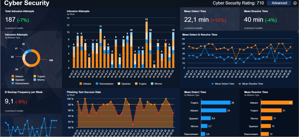
This screen is quite packed, with four graphs, numerous indicators, and loads of numbers. According to human-centered design guidelines, this dashboard might be seen as a bit messy and bewildering. However, if this were a banking app displaying extensive data like spending patterns, credit details, demographics, financial status, or social media activity, it wouldn’t try to squeeze everything onto a single screen.
Here’s the key point: this screen serves as a cybersecurity dashboard, carefully designed for experts who depend on these graphs and numbers to safeguard their platform efficiently. If a designer attempted to tuck away this data behind drop-down menus or tabs, a common method in user-friendly design, it might result in user frustration and a less pleasant experience.
Unprocessed Data
Unprocessed data, often referred to as raw data, constitutes the foundational building blocks of information in the world of data analysis. It is the purest form of data, captured in its natural state without any alterations or manipulations. Imagine it as the freshly harvested ingredients in a recipe, waiting to be prepared. Unprocessed data can take various forms, from text and numbers to images, audio, or any data type collected directly from sources like sensors, surveys, or databases.

An example of an app that deals with unprocessed data is a Weather App. Here’s how unprocessed data is involved:
- Raw Meteorological Data: Weather apps collect diverse raw data from sources like weather stations, satellites, and radar systems, including temperature, humidity, wind speed, and more.
- Unprocessed GPS Data: The app uses raw GPS data to pinpoint the user’s location and provide local weather forecasts.
- Real-Time Observations: Weather apps get real-time, unprocessed observations from global weather stations, including data on rainfall, cloud cover, and visibility.
- Weather Radar Data: Weather apps track storms and precipitation using unprocessed radar data, including rain or snow intensity and movement. This data is collected directly from radar measurements.
- Satellite Imagery: Satellite images of the Earth’s surface are another source of unprocessed data used by these apps. These images capture cloud cover, storm systems, and other weather-related phenomena.
- User-Reported Data: Some weather apps enable users to report local conditions, like rain or snowfall, which is added to the app’s data without immediate validation.
- Historical Data: Weather apps can store unprocessed historical data, like past temperatures, rainfall, and sunshine hours.
Processed Data
Processed data undergoes operations to enhance its organization, utility, and suitability for specific goals, including cleaning, aggregation, and analysis.
- Structured: Processed data is typically organized into a structured format, making it easier to work with and analyze.
- Cleaned: Any errors, duplicates, or inconsistencies in the data are usually resolved during the processing stage.
- Analyzed: Processed data often includes insights or results of data analysis, such as averages, trends, or statistical summaries.
- Contextual: Processed data may be enriched with additional information or metadata to provide context for users.
- Ready for Presentation: It is often presented in a format that is ready for presentation, such as tables, charts, or reports.
- Reduced Volume: In some cases, processed data may be condensed or aggregated to reduce its volume while retaining critical information.

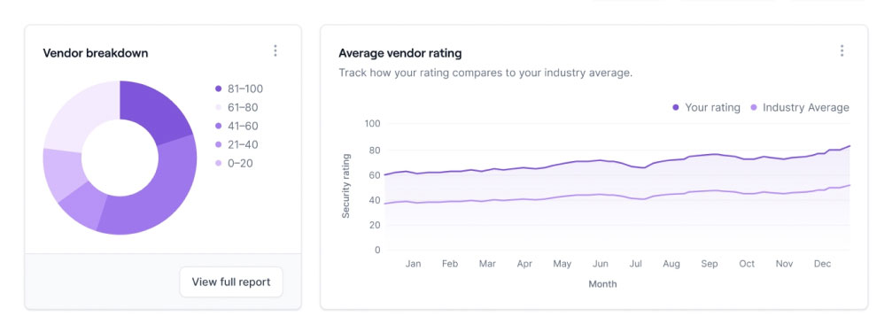
An instance of an app that handles processed data is a Risk Management application. This app involves the continuous analysis of user ratings, tracking changes in an individual’s or business’s financial situation. Based on user feedback, the provider can make necessary adjustments to enhance the overall user experience.
Processed data is a vital stage in the data pipeline, making raw data usable for decision-making, reporting, or further analysis. It’s the result of data preparation, enhancing data’s meaning and utility.
Data Product Algorithms
It’s clear that the product prioritizes algorithms over raw data. As we advance from the initial data products, the focus shifts from user-driven data manipulation to automated data processing. Concurrently, the design becomes more user-friendly, broadening the potential user base and improving visual clarity.
Anomaly detection is a prime illustration of a valuable algorithm for product data analysis. It guarantees product quality in manufacturing, maintains shipment integrity in supply chain management, and plays a crucial role in fraud detection in e-commerce, predictive machinery maintenance, network security, inventory optimization, energy efficiency, healthcare device monitoring, environmental warnings, and user behavior analysis. These algorithms automate anomaly detection, enhancing quality, security, and efficiency in various industries
Decision support
These products display, analyze, and present data, but the ultimate decision-making responsibility lies with the user. We’ve had experience working with such products. When designing decision support products, our primary emphasis is on presenting data sets to users in a manner that is easy to read, comprehend, and facilitate informed decision-making.
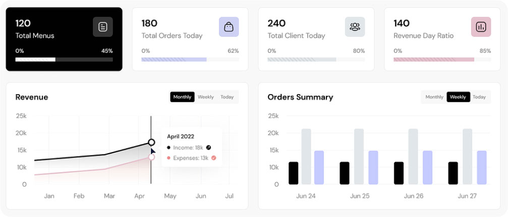
In the comprehensive restaurant dashboard, you’ll find key details like menu count, daily orders, total client visits, and revenue ratios. The dashboard includes a user-friendly revenue graph, visually presenting income and expenses over months for a holistic view of the restaurant’s performance. Furthermore, the order summary offers insights into the total number of received orders, giving restaurant management the tools to make informed decisions, implement changes, and elevate overall quality.

Similarly, this type of dashboard presents processed data in a manner that facilitates effective management, decision-making, problem identification, and solution finding.
Automated decision processes
Automated decision processes represent a significant technological advancement with widespread applications in business and technology. These processes employ algorithms and data analysis to swiftly and accurately make decisions, often in real-time, enhancing operational efficiency while reducing human errors.
It’s worth noting that, even with the power of automation, human oversight remains essential, particularly in sensitive or critical decision contexts. Striking the right balance between automation and human involvement is key to ensuring fairness, accountability, and responsible decision-making.


