How to design user experience for D2C brands: Top best practices
March 18, 2021 | Read Time : 3 mins
Table of Contents
Today, markets are seeing a new branch of brands that are revolutionizing the industry- direct-to-customer or D2C brands that produce and distribute their products without the middlemen.
What are D2C brands?
D2C stands for direct-to-customer. These are companies that produce, package, and distribute their products by themselves. Unlike other companies that sometimes use shipping facilities or retailers to distribute their products, D2C brands cater to the users directly.
Like any other brand, D2C companies often use social media to promote their brand. D2C brands ensure proper and honest communication between the brand and its customers.
How are D2C brands different from other brands?
The D2C model establishes a kind of transparency between brands and customers. End customers are assured that they are receiving their product from the retailer themselves. With e-commerce seeing a boost last year, it is only natural that customers expect to be satisfied with a purchase made online.
According to the IBEF, “India’s e-commerce order volume increased by 36% in the last quarter of 2020.”
Refer: https://www.ibef.org/industry/ecommerce.aspx
D2C brands pretty much remove the middlemen from the picture by eliminating organizations that subtract from your brand’s profits. As absurd as it sounds, it benefits the brand in more than one way. As a brand, it gives you a better insight into customer data by creating various demographics and how to cater to who.
As the owner of a D2C brand, you tend to have more control over brand reputation, which is unlikely to happen with common retailer brands. This puts you, as a brand, in direct contact with your end customer. It also helps to understand your customer better and be able to meet their expectations.
What role does UX design play in the efficiency of a brand?
UX is a parameter that shapes customer delight. Enriching user experience equals happy customers. These satisfied customers share their knowledge through customer feedback and conversations, which then sheds light on your brand.
“If you build a great experience, customers tell each other about that. Word of mouth is very powerful.”
-Jeff Bezos, CEO of Amazon
User experience on your platform ultimately decides the ‘experience‘ a customer has while browsing your site. It creates a great first impression of your company.
Below are examples of D2C brands with simple yet understandable user experience:
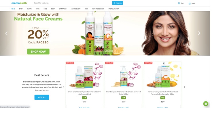
MamaEarth
Mamaearth is a skin and hair care brand and is one of the widely recognised D2C brands in India. The site here has a particular colour story where the colours used on the packaging are more or less similar to the logo itself.
Everpret
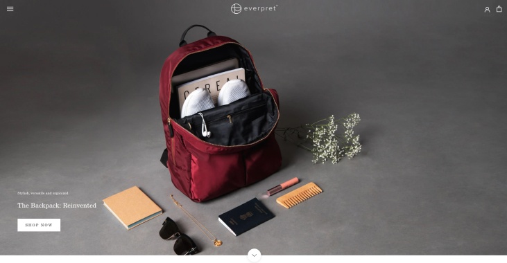
Chic and simple, the brand focuses on its primary subject, designer bags for working women. The UX is straightforward and not too complicated and offers the customers just what they are looking for.
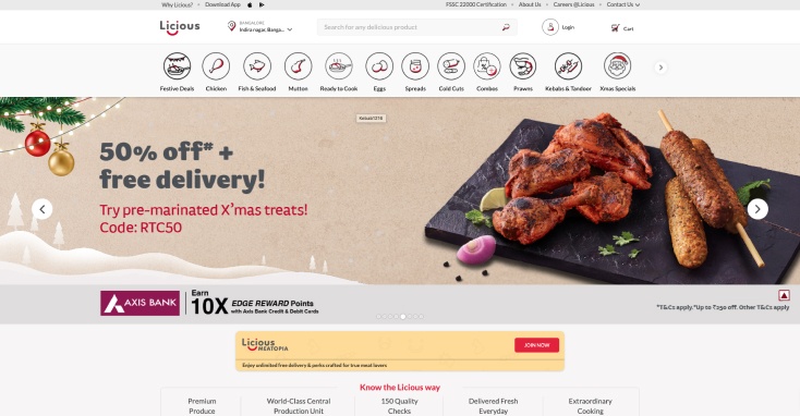
Licious
Licious is a meat and seafood company that is also a D2C brand that delivers directly to customers. They operate on a farm-to-fork model, owning and the back-end supply chain. The company site is, once again, simple but highlights its strong points.
Function of Beauty
A brand that customizes its products based on the quiz taken by the customer. An enlarged and crisp product image makes the products stand out on the homepage itself. The site also gives users the choice of which quiz they want to take. It mentions its most vital point, which is the customizing feature. The colour story matching the products ties the site together.
This is also an example of a direct-to-customer brand.
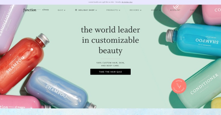
As you can see in the above examples, your UX need not be too complex. Something all these brands have in common is simplicity and functionality, which at the end of the day, form the foundation of user experience.
How can UX design promote your brand?
Now is the time to talk about user experience and direct-to-customer brands. Your D2C brand website or application needs to have a well-distributed section of promotional information.
Below mentioned are laws of UX that you can consider while designing for your brand.
Fitt’s Law
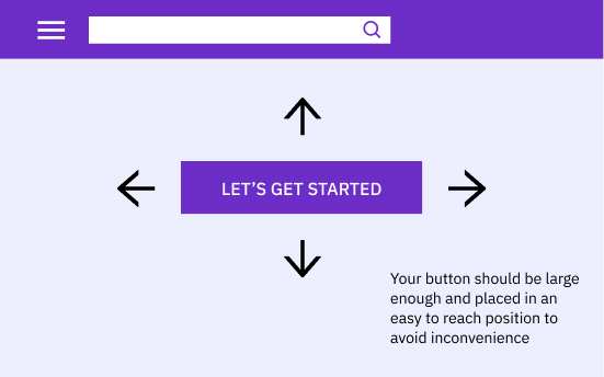
Fitt’s Law states that “the time to acquire a target is a function of the distance to and size of the target”. This simply implies that the longer the distance and the smaller the size of the target, the longer it takes for the user to reach. The aim of this is to reduce the distance between two points and make the target object (example. Buttons) large enough.
Hick’s Law
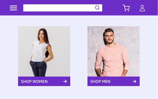
Hick’s Law states that “the time it takes to make a decision increases with the number and complexity of choices.” It means minimizing the choices on your interface and breaking complex ones into subunits. The longer time it takes for users to make choices, the more likely they are to get frustrated.
Depicted here is an example of how you can limit options on your site. Keep it to a maximum of two to three options and avoid cluttering with too many options to choose from.
Jakob’s Law
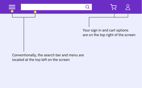
This law states that “users spend most of their time on other sites. This means that users prefer your site to work the same way as all the other sites they already know“. According to this, you need to focus on using UX patterns that users are accustomed to.
For example, including a search bar in a convenient place such as the top of the screen will be something the user is already expecting.
Miller’s Law
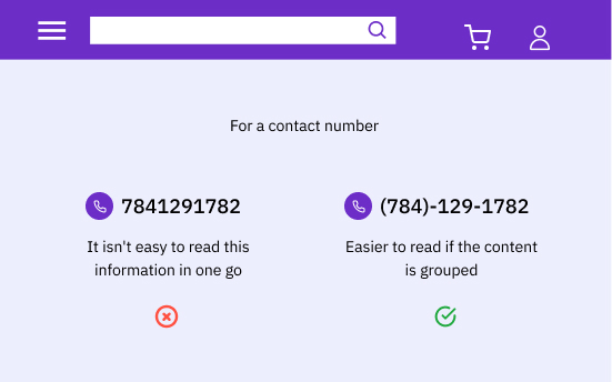
The average user can only keep 7 (plus or minus 2) items in their working memory. Here try to group information instead of large chunks scattered on the screen.
Essentially, you can keep the following points in mind while designing UX for your D2C brand:
Consistency
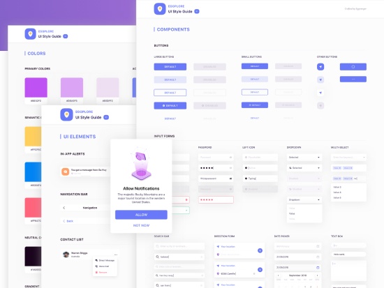
Being consistent with your UI design helps users learn how to use your design faster. This can be something like keeping font size, buttons, and headers consistent.
Focus on your users
Put your users at the centre of your product design and development.
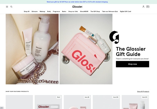
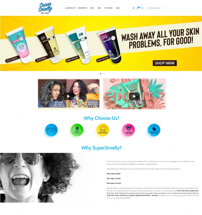
This is an example of a D2C brand that is user-focussed.
Tell a Story
Showcase what your brand stands for, let it speak for itself. Use the right amount of text and explain what needs to be explained.
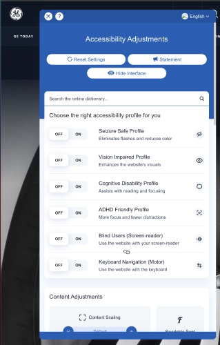
Make your website/app accessible
It is essential in UX design to build according to accessibility requirements and empathize with users. Design for all kinds of devices and people.
Visual Hierarchy
Whether your content or the order in which your website or app flows, it is critical to follow the hierarchy. It must flow naturally.
