Design Systems Examples to Inspire Your Next Project
November 10, 2023 | Read Time : 3 mins
Table of Contents
Design systems are reusable components, guidelines, and principles that help teams create consistent and cohesive user experiences. They can be applied to various products and services, from websites and apps to physical products and signage.
Benefits of Using a Design System
There are many benefits to using a design system. It can help teams:
- Save time and resources: By reusing components and guidelines, teams can avoid reinventing the wheel whenever they start a new project.
- Improve consistency: Design systems help to ensure that all products and services within a company have a consistent look and feel. This can lead to a better user experience and make learning and using new products easier.
- Promote collaboration: Design systems can help to bridge the gap between designers, developers, and other stakeholders. By providing a common set of components and guidelines, everyone can work together more effectively to create a better product.
How to Choose and Use a Design System
When choosing a design system, it is important to consider your team’s and project’s specific needs. What are the most important things for your team to focus on? What are the key features and functionality of your product or service? Choose a design system that can help you achieve your goals.
Here are some tips for choosing and using a design system:
- Start small: You don’t have to implement an entire design system all at once. Start by adopting a few key components and guidelines. As you become more comfortable with the design system, you can gradually add more elements.
- Get everyone involved: Design systems are most effective when used by everyone on the team, including designers, developers, and product managers. Make sure to get everyone involved in selecting and implementing the design system.
- Provide training and support: Once you have chosen a design system, it is important to provide training and support to your team. This will help them to learn how to use the design system effectively and create consistent and cohesive user experiences.
7 Design Systems Examples for Your Inspiration
1. Airbnb’s Design System
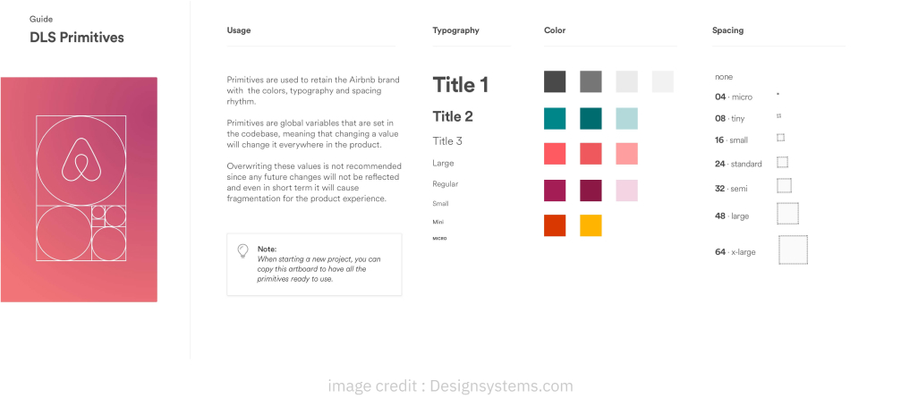
Airbnb’s design system, Aphrodite, is renowned for its focus on simplicity, clarity, and localization. It includes everything designers and developers need to create Airbnb-branded products, including typography, colors, icons, and components.
One of the key features of Aphrodite is its localization guidelines. Airbnb has users worldwide, so its design system must be flexible enough to accommodate different cultures and languages. The localization guidelines guide adapting Airbnb’s design elements for different locales while maintaining a consistent brand experience.
2. Google Material Design
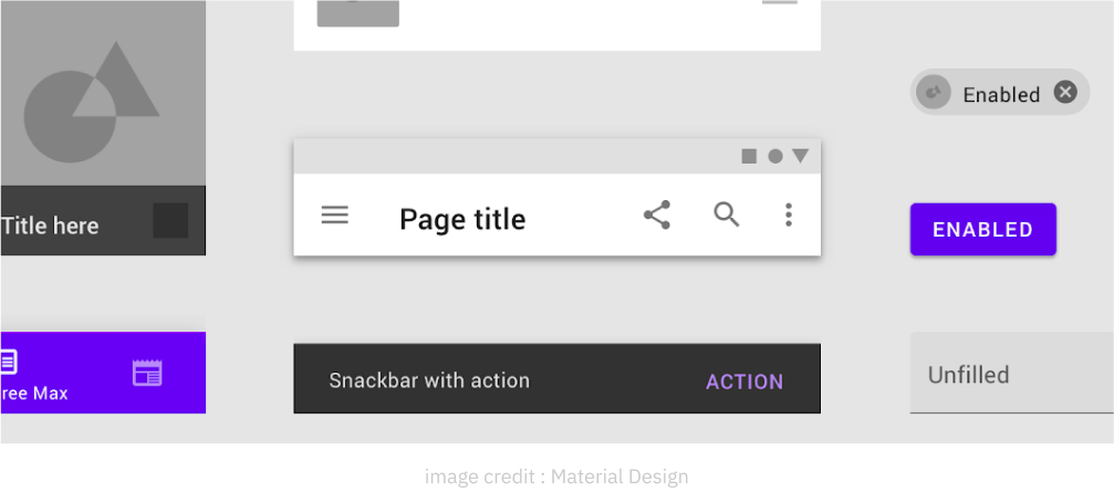
Google Material Design is a design language that provides a unified user experience across all Google products. It’s based on motion, depth, material, and light principles, creating a sense of realism and immersion for users.
Material Design is known for using bold colors, fluid animations, and responsive interfaces. It’s also highly accessible, with features such as high-contrast color schemes and large fonts that make it easy for users with disabilities to interact with Google products.
Some specific examples of Material Design in action include the Google Search interface, the Gmail app, and the Android operating system.
3. IBM Carbon Design System
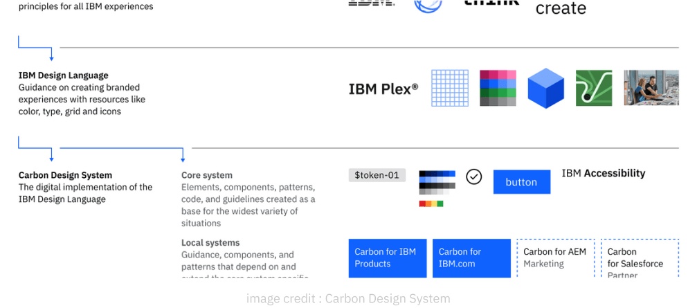
IBM’s Carbon Design System is a comprehensive design system tailored to enterprise users’ needs. It includes many components, such as data tables, navigation menus, and forms, that can be used to build complex and scalable interfaces.
The Carbon Design System is also highly customizable, allowing teams to adapt it to their needs. For example, teams can choose from various color palettes and typographies to create a unique look and feel for their products.
Some notable case studies associated with the Carbon Design System include the IBM Cloud console and the Weather Underground app.
4. Shopify’s Polaris Design System
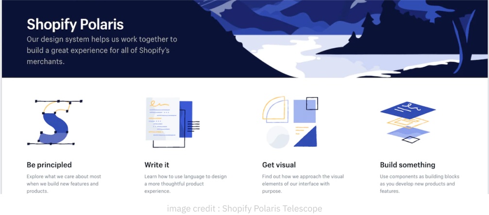
Shopify’s Polaris Design System is a design system that’s specifically designed for e-commerce platforms. It includes various components, such as product grids, checkout forms, and shopping carts, that can create user-friendly and engaging online stores.
Polaris Design System is also highly responsive, ensuring that online stores look and function great on all devices, from desktop computers to smartphones.
Some real-world examples of Polaris implementation include the Shopify admin dashboard and the Shopify app.
5. Atlassian’s Design Guidelines
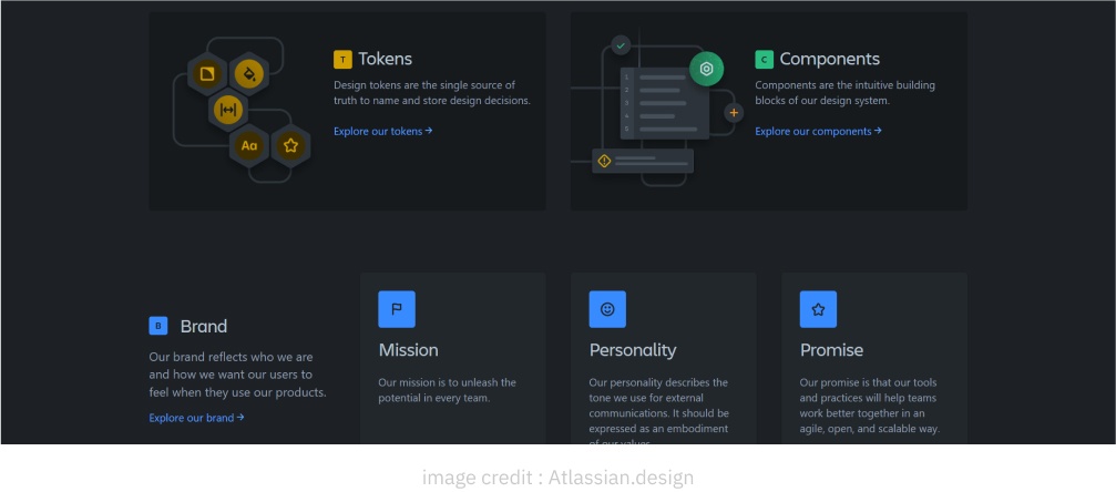
Atlassian’s Design Guidelines are principles and guidelines that help teams create consistent and user-friendly interfaces for Atlassian products. The guidelines cover everything from typography and color palettes to UI patterns and interaction design.
One of the core principles of Atlassian’s design guidelines is simplicity. The guidelines emphasize the importance of using clear and concise language and avoiding unnecessary clutter. This helps to create interfaces that are easy to understand and use, even for complex tasks.
Another important principle of Atlassian’s design guidelines is consistency. The guidelines guide how to use common UI patterns and design elements consistently across all Atlassian products. This helps users learn how to use one Atlassian product and then easily transfer those skills to other products.
Some specific products or features that perfectly showcase Atlassian’s design guidelines include the Jira project management tool and the Confluence wiki platform.
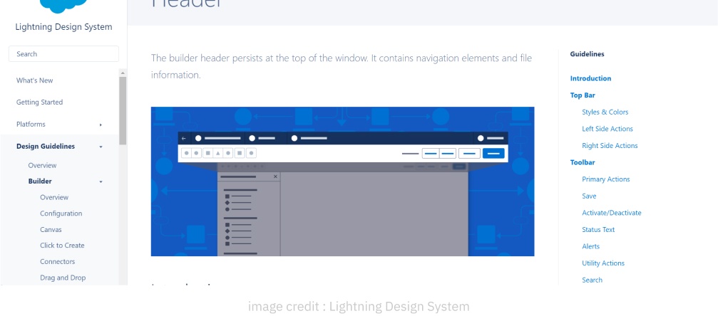
6. Salesforce Lightning Design System
Salesforce Lightning Design System is a design system that’s specifically designed for Salesforce products. It includes many components, such as data tables, navigation menus, and forms, that can be used to build complex and scalable Salesforce applications.
Lightning Design System is also highly responsive, ensuring that Salesforce applications look and function great on all devices, from desktop computers to smartphones.
One of the defining characteristics of the Lightning Design System is its focus on user productivity. The design system includes several features designed to help users complete tasks quickly and efficiently. For example, Lightning Design System components are optimized for touch input, making them easy to use on mobile devices.
Lightning Design System also includes several accessibility features, such as high-contrast color schemes and large fonts, making it easy for users with disabilities to interact with Salesforce applications.
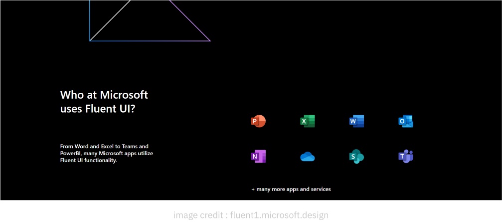
7. Microsoft Fluent Design System
Microsoft Fluent Design System is a design system that’s designed to provide a unified and seamless user experience across all Microsoft products. It’s based on motion, depth, material, and light principles, creating a sense of fluidity and responsiveness for users.
Fluent Design uses subtle animations, dynamic effects, and transparent elements. It’s also highly customizable, allowing teams to adapt it to their needs. For example, teams can choose from various color palettes and typographies to create a unique look and feel for their products.
Some examples of Fluent Design in action include the Windows 11 operating system, the Microsoft Office suite, and the Microsoft Edge browser.
