Can UX be your Trump Card secret weapon for better ranking?
October 8, 2021 | Read Time : 3 mins
Table of Contents
According to user experience statistics, 79% of internet users who don’t like a site’s UX and UI will start searching for other sources right away. Be where your target audience is, with SEO rankings aided by good UX and UI.
So far, we have understood how UX and SEO are in an endless loop:
- Search engine optimization (SEO) aims to rank your website higher or lower in search results, which influences its success.
- Efficient UX and behavioural design principles, guide the users engage with the website and help achieve both user goals and key events as defined by the business
- This type of behaviour results in quality time spent by users on the site. This parameter in turn contributes to making the website rank high in Search Engines
Kim Krause Berg, in a Twitter poll, asked her followers
Two website walks into a bar
1st website: Completes all the criteria to achieve high ranking in search engines
2nd website: Has an outstanding Information Architecture
The crowd follows both the website into the bar
Whom do you think the bartender will serve first?
The replies on the poll were mixed, but to understand the difference between both, let’s take a look at what makes a good UX.
Levent Gurses defines user experience as a journey that starts from the first glance of a brand or an ad or the first step into a store and continues through the product or service used to get customer support and upgrade to newer versions. The totality of this journey is what defines the user experience.
UX acts as a bridge that combines user and business goals with the help of research, user journeys, information architecture, and other design elements.
Few good examples of UX :
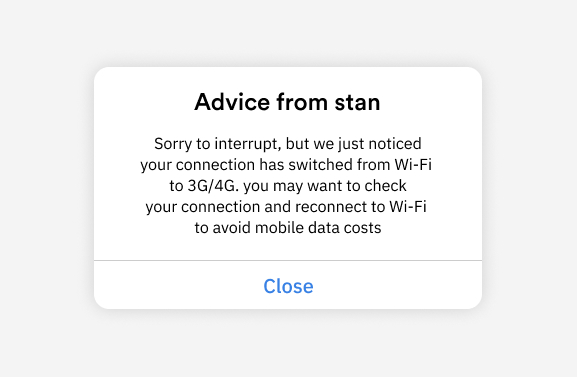
UXPlanet lists Stan as one of the good UX designs.
Stan
Australia’s number one video streaming app, which informs users when their connection is changed from Wifi to a 3g/4g connection. This allows users to
- Visibility of System status
- Help users recognize, diagnose, and recover from errors
- Builds trust factor with the user and help the user feel a sense of control.

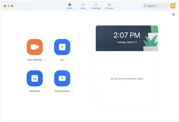
Zoom
Zoom + Google meet has strong growth of over 300 million users due to pandemic
- If we look at the zoom’s homepage(landing page), one can find everything in the four buttons
- Zoom has tried to keep it simple yet effective
- Single page access to all the crucial user goals

How can UX be your trump card to rank better?
Here is the list of a few problems UX can help solve are:
- Page Speed
- Content
- Dwell Time
- Multiple device accessibility
- Site Navigation/structure
So, who will the bartender serve first?
Kim Krause mentions the metrics set for deciding to whom the bartender will serve first are primarily technical. The existing metrics include fast loading pages and security signals.
The replies included from top SEO observers who said the website had earned Google’s SEO badge will be served first. However, others pointed out that with a unique site structure, people will engage and interact with the second website more.
Reply from Google was: “So, you’re saying both meet at a different bar, but at the same bar?” John Mueller asked me on Twitter.”
But what if it’s time to raise the bar?
When a user (maybe not a lead) visits the website, they are not only a guest but can become an admirer. It is a sign of respect to present a well designed, user-friendly website.
The bartender may serve the website first, which can control the traffic and helps in security signals. Still, these metrics are not enough to explain how a user interacts and which website will allow a user to achieve desired goals.
The human experienced design contains:
- Creative User Interface
- Privacy
- Well defined user journey
- Accessibility
- Performance
- Usability
- Human factors
- Information Architecture
- Conversion and Persuasive design
- Inclusive, Responsive, Universal design
- Desirability
- Trust
- Authority
- No pain points
Here are the few ways to help websites raise the bar:
Check the bounce rate
Here, the website needs to notice what elements on the page are making the users go back to search engines. For example, is the sign-up screen on the landing page making users leave the site?
Use colours and shadows
The ‘buy now’ button on various e-commerce sites is of bright colours. Flipkart, one of India’s largest e-commerce websites uses contrast colour psychology wherein the entire webpage one element is of a completely different colour. Flipkart’s buy now’ button is in bright orange. The colour red/orange creates a sense of urgency and makes the user take action.
CTA on different landing pages
Call to action visibility and accessibility is one of the most important things to keep in mind. If the website has a 3-4 landing page, it should focus on keeping CTAs on every page for the user to take action as soon as they land on the page.
Interactive elements
Year of Great site is one of the examples of how the site uses not only good photos and videos but also other interactive animation such as illustrations, 3D elements, realistic real-time lighting, and other design elements.
Typography
The type of font on your website can also play a massive role in engaging the user with the site. People are used to getting helpful information in the form of text, and it is the designer’s job to make it effective and transparent.
UX writing (Content)
The user has not engaged with the website with one feature but multiple features. Writing quality content is also a part of it. If we look at Spotify’s example, it says ‘Listening is everything’ and access to millions of songs and podcasts. The user is informed yet feels with little yet practical text why they should sign up.
Takeaways:
These were a few of the best practices to help you win the game of SEO. One way is by making your UX design more user friendly, intuitive and appealing for users who will be looking up relevant information on Google or other search engine results pages (SERP). A well-designed interface can easily shift a site’s ranking from low-ranked position number 1 all the way up to first place!
The beauty of UX is that it can be a powerful tool for ranking high in search engine results. When creating designs, always think about how users will interact with them and find the most useful parts; give all pages equal weighting so there’s no bias towards anyone page on your website – including 404s! Make sure everything has clear calls-to-action (CTAs) which encourage visitors to take specific actions like purchasing products or signing up as subscribers.


