UX Design Strategies That Can Redouble Your Retention
November 16, 2023 | Read Time : 3 mins
Table of Contents
User Experience (UX) plays a pivotal role in retaining users. A well-designed UX can keep users engaged, satisfied, and returning for more. Conversely, a poorly designed UX can frustrate users and drive them away.
This blog post will explore six UX design strategies that can significantly improve user retention. We will also provide real-world examples of how leading companies have used these strategies effectively.
Intuitive Onboarding
Onboarding is the process of introducing new users to your product or service. It’s a critical first impression, and it can majorly impact whether or not users stick around.
An intuitive onboarding experience is easy to understand and follow. It should guide users through your product’s essential features and functionality without overwhelming them. Here are some examples:
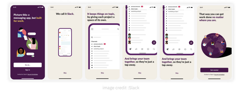
- Slack: Slack’s onboarding process is simple and straightforward. It starts by asking users to create an account and join a team. Then, it provides a step-by-step guide on using the platform’s basic features, such as sending messages, creating channels, and sharing files.
- Dropbox: Dropbox’s onboarding process is also very user-friendly. It starts by asking users to create an account and upload some files. Then, it provides a brief tutorial on how to use the Dropbox website and mobile app.
Here are some additional tips for creating an intuitive onboarding experience:
- Use clear and concise language. Avoid using jargon or technical terms that your users may not understand.
- Provide visual cues. Screenshots, videos, and animations can help users understand better how to use your product or service.
- Break down tasks into smaller steps. Don’t try to overwhelm users with too much information at once.
- Offer personalized support. Give users the ability to ask questions and get help from a real person if needed.
Seamless Navigation
Navigation is how users find their way around your product or service. It should be easy, intuitive, and efficient.
A seamless navigation experience is clear, consistent, and predictable. Users should be able to find the information or features they need quickly and easily without getting lost. Here are some examples:
- Amazon: Amazon’s website has a very clear and consistent navigation structure. The main menu is located at the top of the page, providing easy access to all the major product categories. Additionally, Amazon uses breadcrumb trails to help users track their location on the website.
- Google Search: Google Search has a very simple and intuitive navigation system. The search bar is located at the page’s center, allowing users to search for anything on the web. Additionally, Google provides a variety of navigation filters and tools to help users refine their search results.
Here are some additional tips for creating a seamless navigation experience:
- Use a clear and consistent navigation structure. This will help users to learn how to navigate your product or service quickly and easily.
- Use clear and concise labels. Make sure that your navigation labels are easy to understand and identify.
- Use visual cues. Breadcrumb trails, icons, and other visual cues can help users track their location on your product or service and find their way back to where they started.
- Provide search functionality. This will allow users to quickly find the information or features they need, even if they don’t know exactly where to look.
Contextual Feedback and Assistance
Contextual feedback and assistance provide users with timely and relevant help and guidance. It can help users learn how to use your product or service more effectively and help them troubleshoot any problems they encounter. Here are some examples:
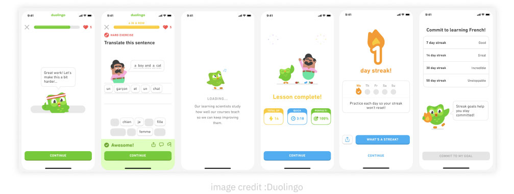
- Duolingo: Duolingo is a language learning app that gives users real-time feedback on their pronunciation and grammar. This feedback helps users learn more effectively and avoid making common mistakes.
- Google Maps: Google Maps provides users with contextual turn-by-turn navigation instructions. This assistance helps users get to their destination easily and efficiently.
Here are some additional tips for providing contextual feedback and assistance:
- Use tooltips and help bubbles. These can provide users with brief explanations of using specific features or tools.
- Use real-time feedback. This can help users to identify and correct mistakes as they make them.
- Provide contextual support options. For example, you can allow users to contact customer support directly from the page they are on.
- Use in-app tutorials. These can provide users with step-by-step instructions on using specific features or completing tasks.
Personalization and Customization
Personalization and customization allow users to tailor your product or service to their needs and preferences. This can help users feel more valued and appreciated and make your product or service more engaging and useful. Here are some examples:
- Spotify: Spotify recommends personalized music playlists to users based on their listening habits. This helps users discover new music that they are likely to enjoy.
- Netflix: Netflix recommends personalized movies and TV shows to users based on their viewing history. This helps users find content that they are interested in watching.
Here are some additional tips for personalizing and customizing your product or service:
- Collect user data. This data can be used to understand your users’ needs and preferences and to personalize their experience.
- Use machine learning. Machine learning can be used to analyze user data and identify patterns. This information can then be used to personalize recommendations and other aspects of the user experience.
- Give users control. Allow users to choose how much personalization they want. Some users prefer a highly personalized experience, while others prefer a more general experience.
Speed and Performance Optimization
Speed and performance are essential for a good UX. Users expect your product or service to load quickly and respond smoothly to their interactions. Here are some examples:
- Google: Google’s products and services are known for their speed and performance. For example, Google Search results typically load in less than a second.
- Facebook: Facebook’s website and mobile app are also very fast and responsive. This makes it easy for users to browse their feeds, connect with friends, and share content.
Here are some additional tips for optimizing the speed and performance of your product or service:
- Use a content delivery network (CDN). A CDN can improve the loading speed of your website or app by delivering content from servers closer to your users.
- Optimize your images. Make sure that your images are compressed and optimized for the web. This will help to reduce their file size and improve the loading speed of your pages.
- Use caching. Caching can improve the performance of your website or app by storing frequently accessed data in memory. This means that users will not have to wait for the data to be loaded from the server each time they access it.
- Test your performance. Use a performance testing tool to identify and fix any performance bottlenecks in your website or app.
A/B Testing and Iterative Improvements
A/B testing and iterative improvements are essential for improving your UX over time. By testing different design variations and measuring the results, you can identify what works best for your users. Here are some examples:
- Amazon: Amazon is constantly A/B testing different design elements on its website, such as the placement of product recommendations and the layout of the checkout process. This helps Amazon to optimize the shopping experience for its users.
- Google: Google is also constantly A/B testing different design elements on its products and services. For example, Google Search has been A/B tested hundreds of times over the years.
Here are some additional tips for A/B testing and iterative improvements:
- Start with a clear goal. What do you want to improve with your A/B test? Once you know your goal, you can hypothesize which design variation will likely achieve it.
- Test small changes at a time. Don’t try to test too many things simultaneously, or it will be difficult to determine what is causing the results.
- Use a statistically significant sample size. This will help to ensure that your results are not due to chance.
- Analyze the results carefully. Once you have completed your A/B test, carefully analyze the results to identify the winning design variation.
- Implement the winning variation and continue testing. Once you have implemented the winning variation, continue to test and iterate on your design to improve the UX even further.

