UX Design Patterns: Elevating Simplicity and Intuitiveness
August 23, 2023 | Read Time : 3 mins
Table of Contents
Beyond aesthetics, UX designers are pivotal in creating interfaces that offer effortless navigation and intuitive interactions. To strike this balance effectively, UX design patterns emerge as invaluable tools.
These patterns simplify designers’ work and ensure users can effortlessly engage with the product. This article delves into essential UX design patterns that streamline designers’ tasks and elevate your product’s intuitiveness.
What’s the Use of Design Patterns?
Before we delve into the world of UX design patterns, let’s address a crucial question: What’s the Use of Design Patterns? While artistic innovation is paramount in UX design, design patterns are foundational tools that enhance the designer’s toolkit, streamline the development process, and elevate the end user’s experience.
Established Solutions to Common Problems
Design patterns offer well-tested solutions to recurring design challenges. These challenges often revolve around usability, navigation, and interaction – where user experience shines. By leveraging these established design patterns, designers can sidestep the need to reinvent the wheel with every common obstacle. This expedites the design process and enables creators to focus on refining the intricate details that make a product distinctive.
Faster Decision-Making
In the rapid world of digital innovation, swift decision-making is paramount. Design patterns offer a repository of pre-vetted options, minimizing time spent debating the optimal course of action. Designers can consult these patterns to identify the most suitable approach for their specific context, accelerating decision-making and allowing more time for innovation and refinement.
Enhanced User Familiarity
Consistency in design across different products breeds familiarity among users. Design patterns foster this familiarity as users encounter recognizable design elements that intuitively guide their interactions. This reduces the learning curve, making your product more accessible to a broader audience. Moreover, it boosts user confidence, as they feel a sense of mastery over the interface.
Balancing Creativity and Convention
Design patterns strike a balance between creative innovation and adhering to user expectations. These patterns provide a structured framework where creativity can flourish, ensuring the result is user-friendly and intuitive. Designers can channel their creativity within these guidelines, creating innovative yet user-centric designs.
Efficiency Across Teams
Collaborative design environments benefit immensely from design patterns. They are a shared language bridging gaps between designers, developers, and stakeholders. Design patterns foster a common understanding of design principles, minimizing miscommunication and enabling teams to work efficiently toward a unified goal. This shared vocabulary also eases the handover process between different stages of product development.
User-Centered Approach
Design patterns are rooted in research and testing and align with users’ cognitive processes and preferences. Incorporating design patterns infuses designers’ work with a user-centered approach. This commitment to enhancing the user experience leads to more satisfied and loyal customers, resulting in a deeply resonating product.
The Power of UX Design Patterns
Now that we’ve grasped the importance of design patterns let’s explore their power in shaping exceptional user experiences. These patterns serve as a guiding compass, navigating designers through the intricate seas of UX design while ensuring users enjoy a seamless journey.
The Card Layout Pattern
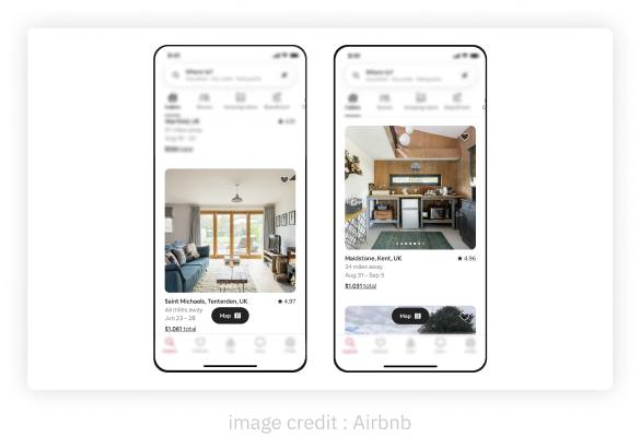
The card layout pattern offers versatility and visual appeal. By organizing content into cards, designers can effectively present information in bite-sized chunks. Platforms like Pinterest and Instagram have mastered this pattern, allowing users to interact with content seamlessly.
The below example showcases the card layout used by Airbnb to display the numerous host listing that are available.
The Progressive Disclosure Pattern
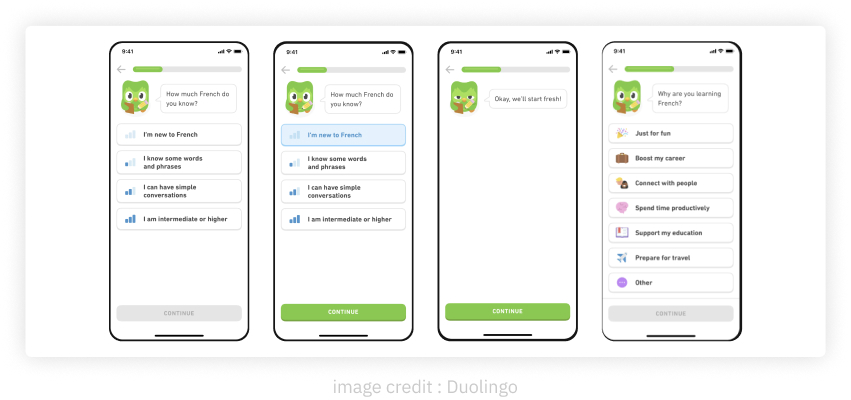
Complexity can overwhelm users. The progressive disclosure pattern reveals information progressively as users engage with the interface. Collapsible sections, tooltips, or step-by-step guides present information only when necessary, enhancing the initial design and the user experience.
Duolingo’s uses a simple disclosure method to find the users proficiency level in a step-by-step journey.
The Navigation Bar Pattern
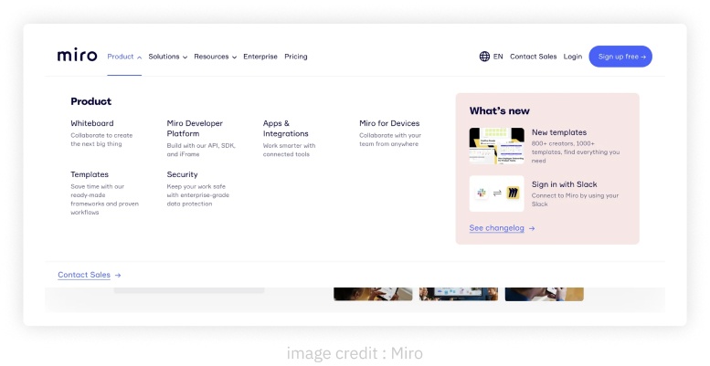
Navigational menus are crucial but can clutter the screen. The navigation drop-downs hides the sub categories options under a main category. When activated, the drawer slides out to reveal the sub topics within, providing easy access without clutter.
Here is an example of a website navigation bar in its expanded state, which showcases all the sub-categories within a category.
The Empty State Pattern
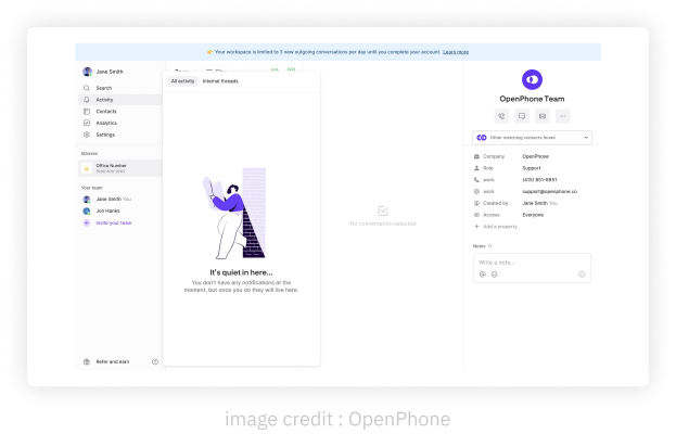
Error messages and empty screens can frustrate users. The empty state pattern transforms these moments into engagement opportunities. Creative illustrations, animations, and messages guide users back on track, creating an empathetic and user-centric experience.
In the below image, OpenPhone displays a creative illustration with message when no notifications are available.
The One-Click Signup Pattern
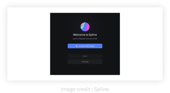
The one-click signup pattern simplifies user onboarding by leveraging social media or single sign-on options. Reducing registration steps lowers barriers to entry, encouraging user engagement from the start.
Here we have an example from Spline, where the user can onboard in one-step using their google account.
The Infinite Scroll Pattern
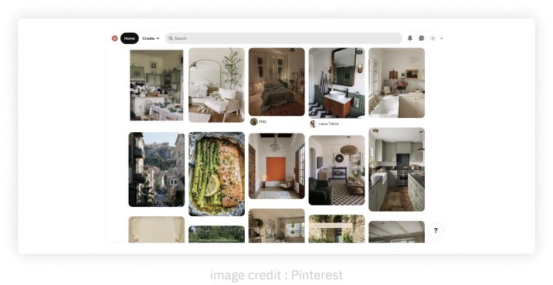
The infinite scroll pattern capitalizes on natural scrolling behavior. Instead of pagination, infinite scrolling loads more content as users scroll down. This pattern simplifies navigation and encourages users to explore more content.
Pinterest uses the infinite scroll pattern to load content as the users scroll reach a certain level.
The Wizard Pattern
The wizard pattern breaks complex tasks into manageable steps. Each step focuses on a specific task, reducing cognitive load and ensuring a smoother experience.
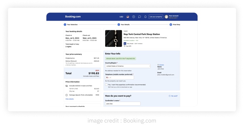
An example where the task of booking a hotel is divided into 3 specific steps for an easier user experience.
