Do’s and Don’ts for Better UX Readability
March 27, 2023 | Read Time : 3 mins
Table of Contents
What does UX readability mean?
In short, readability in UX addresses the issue of whether all users can easily follow, comprehend, and identify the features of your website.
However, it’s important to understand the difference between readability and legibility before diving into this subject. Legibility refers to how easily font characters can be distinguished and read, often known as visual text clarity. Meanwhile, readability relates to the complexity of words in written content.
The content of your product should be equally accessible to all user groups to have decent UX readability. For instance, 2.2 billion individuals worldwide suffer from vision impairment, and 4.5% of the population is colour-blind. Every designer who understands the value of readability should be aware of these problems when designing user interfaces.
The ability to distinguish between good and bad readability is also critical.
How to know if the UX is unreadable?
Readability measures how easy the written content is to read and follow. Copywriters, content writers, and designers are in charge of ensuring that written content is readable. Complex and long sentences, for example, could be clearer to follow and comprehend.

Here are five ways to identify poor readability:
- Dimensions of the typeface: The first indication of poor readability is an imbalance of typefaces.
- Line’s height and width: Bad readability is caused by lengthy lines requiring scrolling or more work.
- Case type: To improve readability, it is recommended to blend uppercase or lowercase letters.
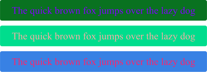
- The colour of the text: Poor colour selection or colours that clash with the background instantly degrade readability.
- Contrast: The text is illegible due to the high contrast between the font and background colours.
The screen’s size, technology, contrast, font size, colour, and text style all influence experience. These adjustments can enhance a users experience of the product.
The significance of typefaces for readability
One of the most crucial elements affecting readability is the use of fonts. Typography is arranging text letters to create legible and aesthetically pleasing written content. There isn’t a winning formula for the best typefaces to utilise for high readability because it’s such a broad topic in design.
Some typefaces are better suited for long reads, while others are better suited for titles and headers. Some are simply outdated, while others perform better in tiny or large font sizes in printed or digital media. Designers constantly maintain a delicate balance between current trends and user requirements.
7 Essential Tips to Improve UX Readability:
Below are some important tips that will help you improve your product’s or website’s readability and legibility.
Choose typefaces carefully
Remember that various typefaces perform better at different sizes. Refrain from using overly complicated or widely used typefaces since they annoy users and is being used everywhere. For instance, users may identify once-popular gothic typefaces like Comic Sans since they are currently out of style.

Avoid visual distractions
Using typefaces that are easy to read on screens is essential for improving UX readability. Simple and legible fonts like sans-serif styles are recommended, as they are more readable on screens compared to complex or decorative fonts. This helps to ensure that users can quickly and easily consume content without any visual distractions.

Harmonize colors for optimal impact
When selecting colors for user interface designs, it’s important to choose hues that stand out from the background without creating too much contrast. This helps to improve UX readability by making the content easy to read and reducing eye strain.

Maintain the visual hierarchy
Maintaining a clear visual hierarchy is crucial for improving UX readability. By organizing content based on its level of importance and using design elements like size, color, and spacing to guide the user’s attention, designers can create a more intuitive and easy-to-understand interface.
Lorem ipsum dolor sit amet, consectetur adipiscing elit, sed do eiusmod tempor incididunt ut labore et dolore magna aliqua. Ut enim ad minim veniam, quis nostrud exercitation ullamco laboris nisi ut aliquip ex ea commodo consequat. Duis aute irure dolor in reprehenderit in voluptate velit esse cillum dolore eu fugiat nulla pariatur.
Lorem ipsum dolor sit amet, consectetur adipiscing elit, sed do eiusmod tempor incididunt ut labore et dolore magna aliqua. Ut enim ad minim veniam, quis nostrud exercitation ullamco laboris nisi ut aliquip ex ea commodo consequat. Duis aute irure dolor in reprehenderit in voluptate velit esse cillum dolore eu fugiat nulla pariatur.
Make sure that lines of text are short enough
To improve UX readability, it’s important to ensure that lines of text are not too long. Shorter lines are easier to read and can help prevent eye strain and fatigue. Designers can achieve this by adjusting font size, line spacing, and column width to create a more comfortable reading experience.
Limit the number of typefaces used on each screen
To maintain UX readability, it’s important to limit the number of typefaces used on each screen. Using too many different fonts can make the design feel cluttered and confusing. By sticking to one or two typefaces that are consistent throughout the design, users can better understand and navigate the interface.

Confusing backgrounds can render even the greatest typeface unintelligible
The background of a design plays a crucial role in UX readability. Even the best typeface can become unintelligible if it’s placed against a confusing or distracting background. Designers should choose backgrounds that complement the text and ensure that there is enough contrast between the two to make the content stand out clearly.


